Last Friday saw Asante Kotoko officially outdoor their new jerseys, supplied by Portugal-based manufacturer Strike, to much fanfare at Kumasi’s Manhyia Palace.
Daily Mail GH reviews the lot.
1. STYLE & DESIGN (B+)
To start with, Strike went for a V-neck collar style on all three shirts. The first-choice kit is a stripped-down version of last year’s, featuring more red (the colour that, perhaps more than any other, defines Kotoko), with strokes of white limited to the names, numbers, manufacturer’s logo, markings and inscriptions around the cuffs. A subtle mesh-like pattern finishes off the design.
The all-white new away jersey isn’t very unlike its predecessor, with the collar and cuffs featuring a red flavour that provides some fine contrast. Gone, though, are the thick red lines that piped down the sides of the maiden offering, but a giant watermark of the club’s famous badge on the front more than compensates for the not-so-conspicuous omissions.

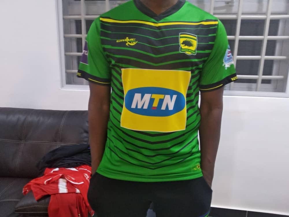
For the first time, Strike has served a third strip, one that reaches deep into the club’s Asanteman roots. Red has been Kotoko’s colour of choice throughout generations, but the only hues of prime importance to the two-time African champions are the yellow, green and black of the Asante people, hence this new outfit would please many a purist.
The body is a bold block of green covered by layers of black — arrowing slightly downwards — that decrease in thickness as they descend. The tip of the V-shaped neck — dark, as are the cuffs and side panels — almost kisses a standout line of yellow, with the latter colour also appearing just before the shirt’s sleeves cut off. Over black shorts and yellow socks, it is quite the catch.
2. QUALITY (B+)

It isn’t for nothing that the relatively new Strike brand keeps growing in popularity across Ghana, with the company adding other Ghanaian clubs and institutions to a clientele headlined, of course, by Kotoko. The kits are of good quality and should appeal to all who get to feel/wear it.
3. REPRESENTATION (A)
The designs are undeniably made in Kotoko’s image. All three shirts have an extra badge just above where the names would be plastered as well as the inscription of the club’s name on the cuffs, while the aforementioned watermark takes it up a notch. The largely red design of the home kit makes it even more representative, as does the colorful third jersey.
4. ACCEPTANCE (B)

Kotoko’s sparkling new three-kit set should not be hard to sell, if the club’s numerous fans are to queue up at the shops. For GHC 120, though — only a little less than archrivals Hearts of Oak’s recently delivered Umbro products are going for — it remains to be seen just how many would be keen to part with a sum higher than was required for the previous replicas. Perhaps they would be inspired by prominent Kotoko fan Christopher Damenya’s willingness to shell out a staggering GHC100,000 for a single piece at last week’s unveiling, no?
5. SUMMARY (B+)

For the minimalists and traditionalists, there isn’t much to complain about. However, there is also enough style to attract latter-day fans of the Porcupine Warriors. The prices could have been lower, yes, but Strike — and Kotoko — should be proud of themselves.
NY Frimpong — Daily Mail GH